Lab 18: Dimensionality Reduction#
For the class on Wednesday, April 9th
A. Principal Component Analysis (PCA)#
We will apply Principal Component Analysis on the handwritten digits dataset. The specific dataset used here is the one included in scikit-learn, which comes from the UC Irvine (UCI) Machine Learning Repository.
The digit images originally come from the National Institute of Standards and Technology (NIST). As such, the handwritten digits dataset is commonly referred to as the MNIST (Modified NIST) database.
import numpy as np
import matplotlib.pyplot as plt
from sklearn.datasets import load_digits
from sklearn.decomposition import PCA
# Load digits data
data_digits = load_digits(as_frame=True)
# Inspect raw data
instance_index = 42  # change this to inspect other instances

fig, ax = plt.subplots(figsize=(2,2))
ax.matshow(data_digits.data.iloc[instance_index].values.reshape(8,8), cmap="Greys");
ax.axis("off");
ax.set_title(f"{data_digits.target[instance_index]}");

# Apply PCA to data, and then project the data to the principal component (PC) axes.
pca = PCA()
pca.fit(data_digits.data)
data_after_pca = pca.transform(data_digits.data)
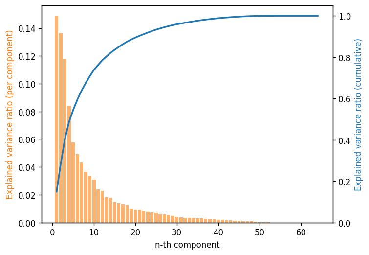
# Make Scree plot
fig, ax = plt.subplots(dpi=120)

x = np.arange(1, pca.n_components_+1)
ax.bar(x, pca.explained_variance_ratio_, align="center", color="C1", alpha=0.6)
ax.set_xlabel('n-th component')
ax.set_ylabel('Explained variance ratio (per component)', color="C1")

ax2 = ax.twinx()
ax2.plot(x, np.cumsum(pca.explained_variance_ratio_), color="C0", lw=2)
ax2.set_ylabel('Explained variance ratio (cumulative)', color="C0")
ax2.set_ylim(0, 1.05);
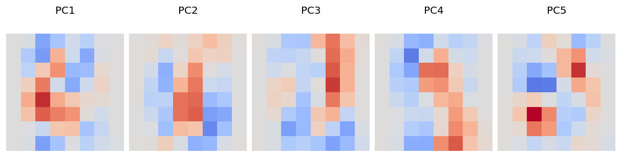
# Visualize the first 5 PCs

fig, ax = plt.subplots(1, 5, figsize=(10, 2.5), dpi=120, constrained_layout=True)
for i, ax_this in enumerate(ax.flat):
    ax_this.matshow(pca.components_[i].reshape(8,8), cmap="coolwarm", vmax=0.4, vmin=-0.4);
    ax_this.axis("off")
    ax_this.set_title(f"PC{i+1}")
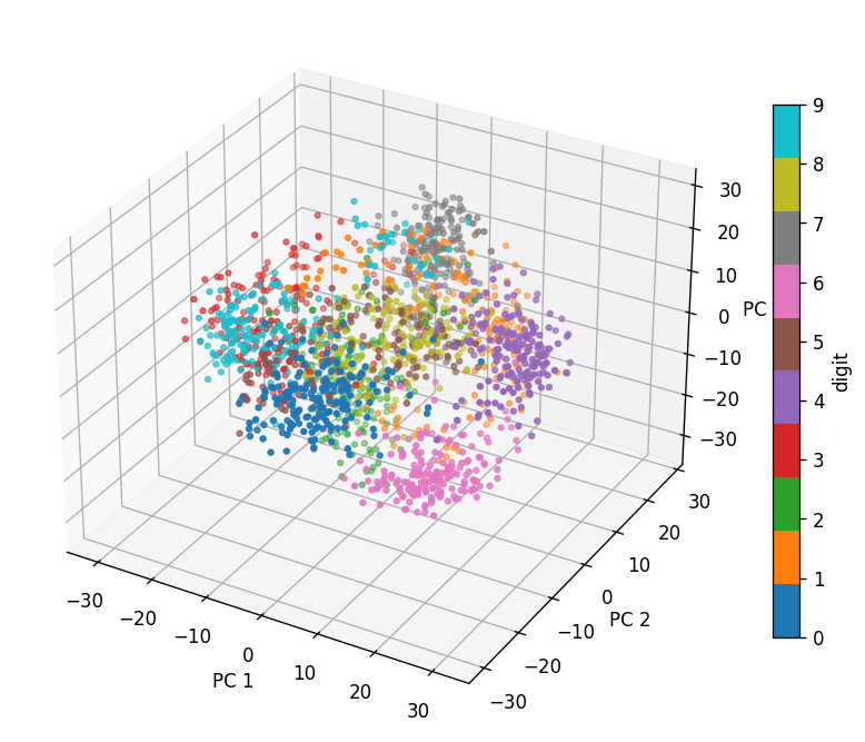
# Project the digits data in the first 3 PCs and display them in a 3D scatter plot

fig = plt.figure(figsize=(7,6), dpi=120)
ax = fig.add_subplot(projection='3d')
cs = ax.scatter(data_after_pca[:,0], data_after_pca[:,1], data_after_pca[:,2], c=data_digits.target, cmap="tab10", s=8)

ax.view_init(30, -60)  # change these two numbers to rotate the view

ax.set_xlabel("PC 1")
ax.set_ylabel("PC 2")
ax.set_zlabel("PC 3")
plt.colorbar(cs, label="digit", shrink=0.7)
fig.tight_layout()
📝 Questions (Part A):
How many components do you need to explain 80% of the variance for this data set?
Based on the 3D scatter plot (you may need to rotate the views to answer the following):
Which digits (0-9) have high coefficients in the first principal component (PC1)?
Which digits (0-9) have high coefficients in the second principal component (PC2)?
Which digits (0-9) have high coefficients in the third principal component (PC3)?
Compare your answers to (2) with the principal component visualization. Briefly (3-4 sentences) describe what you observe. (Note that in the PC visualization plot, red means high positive dependence, blue means high negative dependence, and grey means little dependence.)
Write your answers for Part A here
B. Compare with t-distributed Stochastic Neighbor Embedding (t-SNE)#
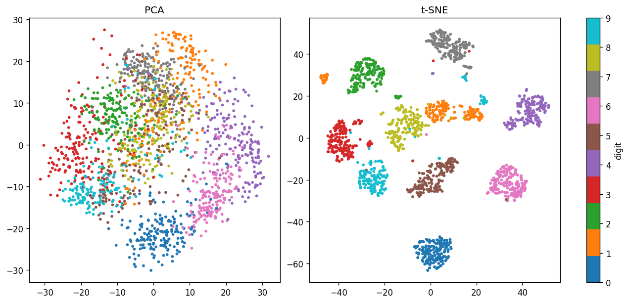
Here we compare the projection of the digits dataset in the first two PCs with the t-SNE projection.
# Fit and transform the digits data with t-SNE

from sklearn.manifold import TSNE

tsne = TSNE()

# Note that `TSNE` does not have the `transform` method, so we must use `fit_transform`
data_after_tsne = tsne.fit_transform(data_digits.data)
# Visualize PCA (first two PCs) and t-S
datasets = [data_after_pca, data_after_tsne]
labels = ["PCA", 't-SNE']

fig, ax = plt.subplots(ncols=2, figsize=(10.5, 5), constrained_layout=True, dpi=120)
for data, label, ax_this in zip(datasets, labels, ax):
    cs = ax_this.scatter(data[:,0], data[:,1], c=data_digits.target, s=6, cmap="tab10")
    ax_this.set_title(label)
plt.colorbar(cs, ax=ax, label="digit");
📝 Questions (Part B; optional):
Why doesn’t t-SNE (
TSNE) have the.transform()method?Based on what you learned from https://distill.pub/2016/misread-tsne/, briefly (3-4 sentences) comment on the difference between the PCA and t-SNE projection.
Write your answers for Part B here (optional)
If you write your answers in this notebook, please submit it following the usual instructions. You can also directly submit your answers on Canvas, either as plain text or a PDF file.
Tip
Submit your notebook
Follow these steps when you complete this lab and are ready to submit your work to Canvas:
Check that all your text answers, plots, and code are all properly displayed in this notebook.
Run the cell below.
Download the resulting HTML file
18.htmland then upload it to the corresponding assignment on Canvas.
!jupyter nbconvert --to html --embed-images 18.ipynb