Different people see colors differently, even those with normal color vision. When using colors in documents, slides, or web content, there are two key principles to follow: use sufficient contrast and combine color with other indicators.
Ensure Sufficient Contrast
To meet the required standard, the text and background colors should (in most cases) have a contrast ratio of at least 4.5:1. There is a formula to calculate contrast ratio, but it is easier to use online tools to check contrast. Here are two useful tools:
This tool allows you to input foreground (text) and background colors and see the contrast ratio. It also indicates whether the color combination meets WCAG standards for normal text, large text, and graphical objects. To meet the federal requirement, the color combination must pass at least the AA standard.
Contrast Grid by Directed Edges
This tool allows you to see a grid of multiple color combinations and their contrast ratios all at once. Pick the combinations that pass the AA standard.
Combine Color with Other Indicators to Convey Information
Because different people perceive colors differently, it is not a good idea to rely on color alone to convey information or to distinguish visual elements.
For example, instead of just using red text to indicate an error, use an icon (with alt text) or a text label (e.g., “Error: ...”) along with the red color. Similarly, in charts and graphs, use different line styles (e.g., solid, dashed, dotted lines) or shapes (e.g., circles, squares, triangles) in addition to colors to distinguish different datasets or data points.
You can also add numbers or letters next to colored elements to help distinguish them. Below is an illustration[1] of this method.
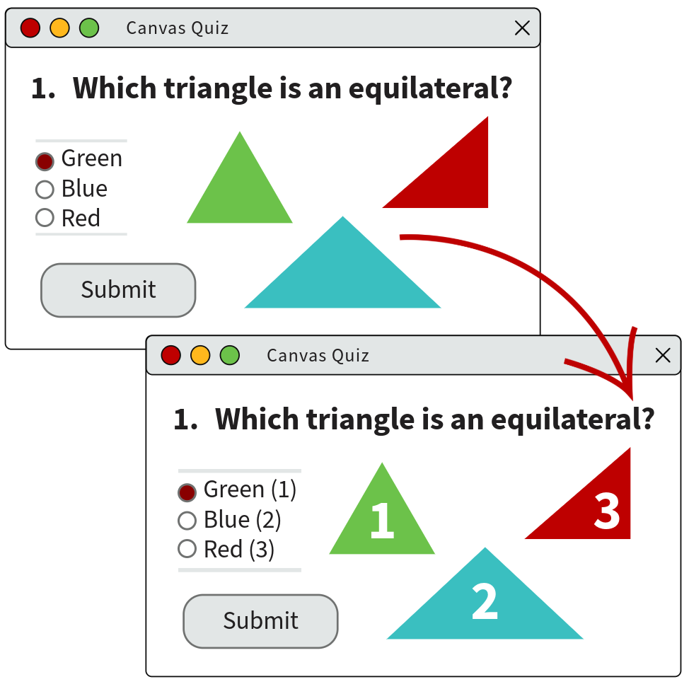
This illustration is adapted from CTE’s Accessibility Essentials page.